5 features we want to see in Android 11
Dear Google, do this to make Android more awesome.
Officially launched in September 2019, Android 10 has proven to be one heck of a release for Google's mobile operating system. The addition of a system-wide dark mode is something users have been clamoring for for years, the new gestures are an improvement over Pie's half-baked attempt, and the revamped permissions are a great step forward for having more control over your data and privacy.
Android 10 may still be fresh in a lot of people's minds, especially since there are plenty of phones that just got or are still waiting for the update, but that doesn't mean it's too early to start talking about Android 11.
Google typically releases the first developer preview for its new Android version in March, and for Android 10, this is also when the first beta debuted. That means we're just a few short months away from getting our first look at Android 11, and when it arrives, these are the features we're the most eager to see.
Dark mode scheduling
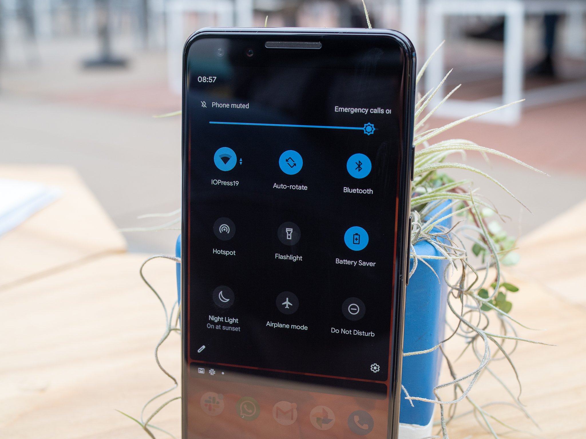
Like I mentioned above, one of the big draws to Android 10 is its inclusion of a dark mode. With just a single tap, you can enable a luscious dark theme for your phone's system elements and any supported apps.
Dark mode in its current form is a joy to have, but there is one key component that's noticeably absent — scheduling.
As it stands in Android 10, you can only turn dark mode on and off by manually tapping the dark mode toggle. It's easy enough to do, but I'd love to see Android 11 add ways to have dark mode automatically do this on its own.
Similar to what we see in other Android interfaces and on iOS 13, Android 11 should allow you to create a custom schedule for dark mode, along with a way for it to turn on and off according to the sunset and sunrise. This would be a very simple change, but one that'd allow dark mode to feel substantially more useful and complete.
Customizable back gesture
For the past two Android updates, Google has introduced new forms of navigation. Android 9 Pie debuted the two-button gesture hybrid, with Android 10 adopting a fully gestural system.
Some people might disagree with me, but I actually really like Android 10's gestures. I was apprehensive when I first saw them, but after using them daily on my Pixel 4 XL, I've come around to enjoying them.
My biggest issue with Android 10's navigation is the gesture to go back. It's done by swiping anywhere from the left or right edge of your screen, and while I've never had an issue with it not working properly, it has rendered slide-out hamburger menus virtually useless.
In Android 11, I'd love for Google to add a way to customize the back gesture. Similar to how gestures are handled in OnePlus's OxygenOS, leaving a section of the screen that ignores the back gesture so you can still open up slide-out menus would be great. Google could also take this up a notch by allowing people to determine which part of the screen is used for slide-out menus and which recognizes the back gesture.
I know not everyone is pleased with how Google handled Android 10's gestures, but the last thing we need is for Google to create another brand new way to navigate Android. If we can get this one little refinement, I think it could bring a lot of people around to welcoming the gestures with open arms.
Built-in screen recorder
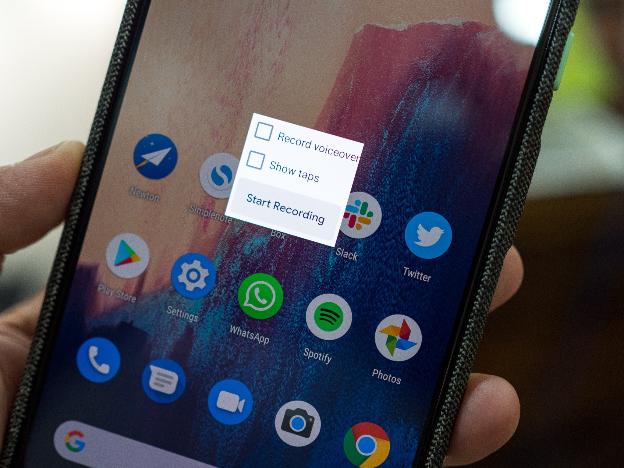
Leading up to the release of Android 10, it was really looking like Google was finally going to add a built-in screen recorder to Android. There was one present in the developer options of the Android 10 beta, but when the public build rolled out, it was nowhere to be found.
Google, don't tease us like that again and then not deliver the goods. With Android 11, there's no reason for a screen recorder not to be included.
This is such a small feature, and adding one should be easy enough to do. It may not be something you use every day, but for those times when I've wanted to record something on my screen, having to dive into the Play Store to find an app that allows me to do this is annoying.
Scrolling screenshot feature
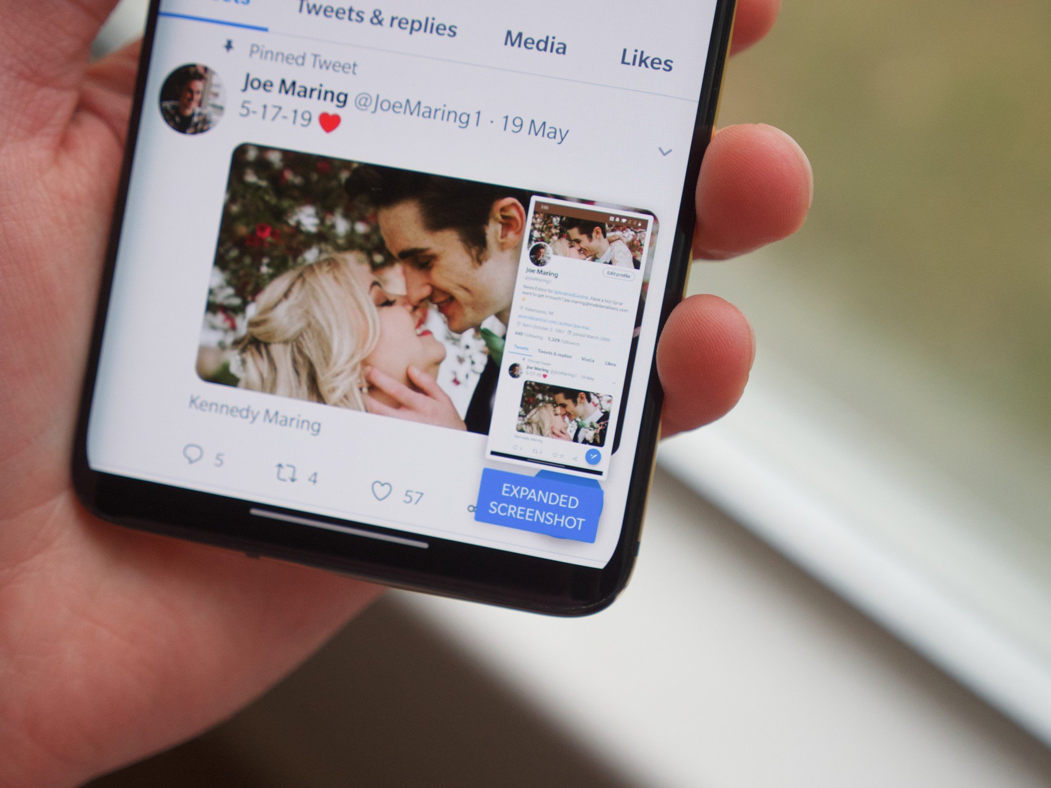
Similarly, I'd love for Android 11 to include a scrolling screenshot feature. Android does a good job capturing a snapshot of what's displayed on your phone, but having a way to expand the screenshot to see things below it would be awesome.
Again, this is something that already exists in some custom Android interfaces. Take OxygenOS again as an example. In my editorial about Amazon's Android app, I used my OnePlus 7 Pro to capture a single screenshot of the app's Account page. It's a long page that takes a lot of scrolling to get to the bottom of, and with the 7 Pro, I was able to take a single screenshot of the whole thing.
Google could (and should) add an option for this in Android 11. Let people take normal screenshots as they already do, but if there's more on their screen they want to capture, have a toggle for expanding the screenshot for however long the user wants.
Fix the 'open by default' UX

For years now, Android has allowed you to set apps to open certain links by default. If you tap a Twitter link, for example, you can have it open up in the Twitter app rather than a web browser.
Previously, this process was straightforward. Sticking with the Twitter example, tapping a Twitter link for the first time would result in a pop-up asking if you wanted to open it in Chrome or Twitter. You could do this Just Once, or if you tapped Always, it would instantly take you to the app you chose along with making that your default option.
Android 10 changed this, and for the life of me, I can't figure out why.
Now, when you tap Always for opening a link in a certain app, you're taken to the "open by default" settings. You then have to tap the "Open supported links" button that's flashing at you and then press "Open in this app." That's two extra taps on a completely different page just to confirm something you already did on the pop-up.
Why does any of this exist? Why add so many extra redundancies for what should be a simple action? There's nothing about this that is user-friendly, and I really, really hope we see it die in Android 11.
What do you want to see?
That's what we're hoping to get in Android 11, but what about you? What features or changes are you most excitedly to (hopefully) see? Drop a comment down below and let us know!
Affordable Android
Google Pixel 3a
Up-to-date software on a budget
The Pixel 3a isn't the latest or most powerful phone in the Pixel lineup, but it does represent the best value. It has an AMOLED display, an incredible 12MP rear camera, great performance, and guaranteed updates through May 2022. At this price, that's quite the package.
from Android Central - Android Forums, News, Reviews, Help and Android Wallpapers https://ift.tt/2MGSMQR

Post a Comment