Android 12 beta hands-on: This is the way forward
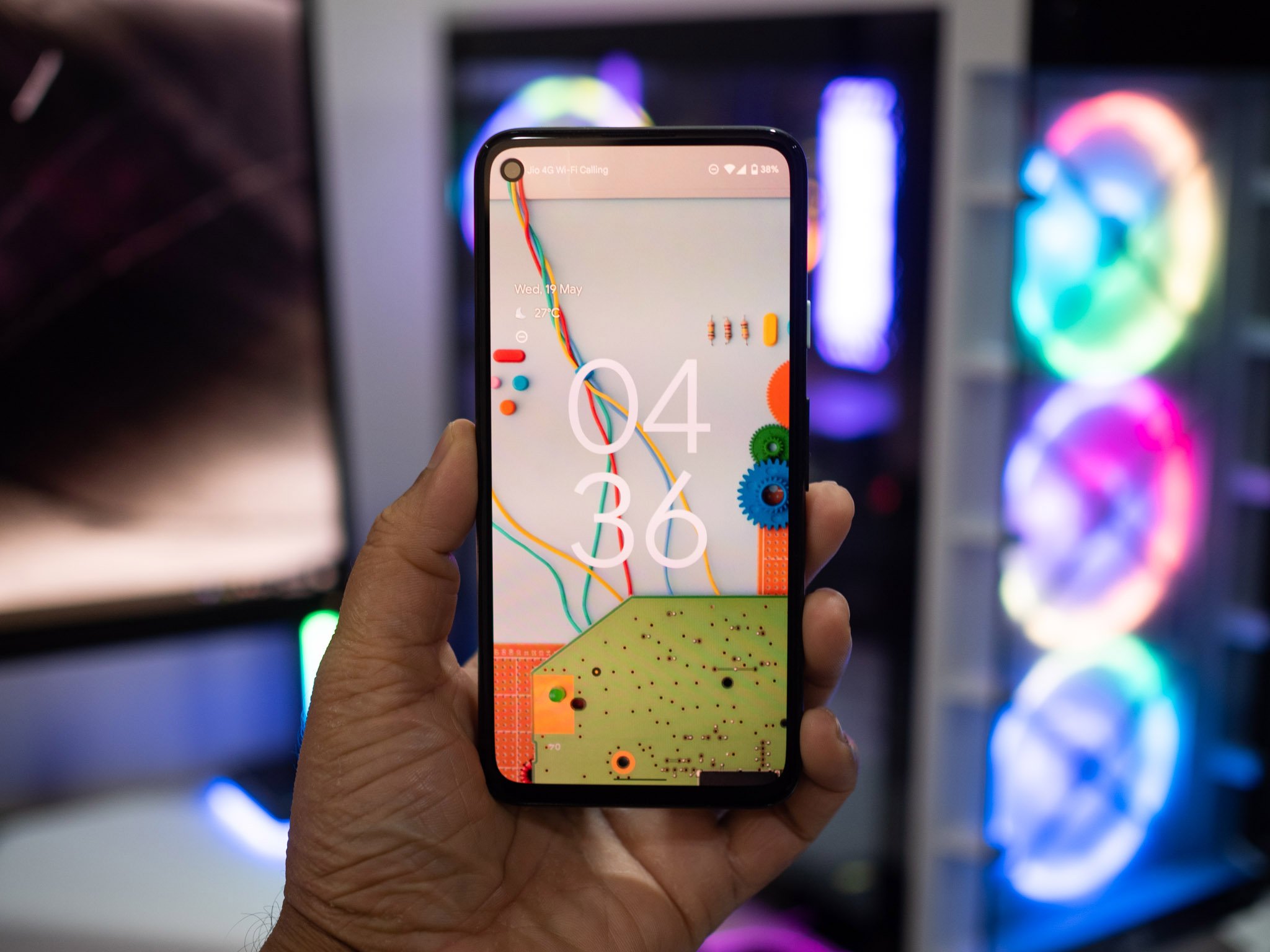
Google's Material You aesthetic gives Android 12 a fresh new look.
Google introduced Material Design back in 2014, and while Android looks very different from seven years ago, the design language itself hasn't changed too much. Google has focused its attention on polishing core interface elements in recent releases, adding better notification management, overhauled gestures, new privacy features, and system-wide dark mode.
With Android 12, Google is embarking on a huge redesign that changes just about every facet of the interface. Google calls this the "biggest design change in Android's history," and that claim is warranted. The new design language is an evolution of Material Design dubbed Material You, and it makes Android much more playful and accessible. The best Android phones feature skins with plenty of customizability, and Google is heading down that path with Android 12.
Of course, Android 12 is much more than a fresh coat of paint. Google is introducing important privacy and security features and making dozens of under-the-hood changes that make the overall experience much better. With the first public beta now live, let's take a look at some of the key changes in Android 12, and whether you should install the update on your phone.
Android 12 gets a big visual overhaul with Material You
The biggest talking point with Android 12 is the Material You design language. Like Material Design, this design paradigm isn't just limited to Android; Google says it will implement the new design across all of its services and products.
The Material You design language makes Android fun and playful.
While Material Design got a lot right in terms of aesthetic, it never really felt personable. Google is aiming to change that with Material You. Google says the new aesthetic "explores a more humanistic approach to design," and that's conveyed through increased personalization.
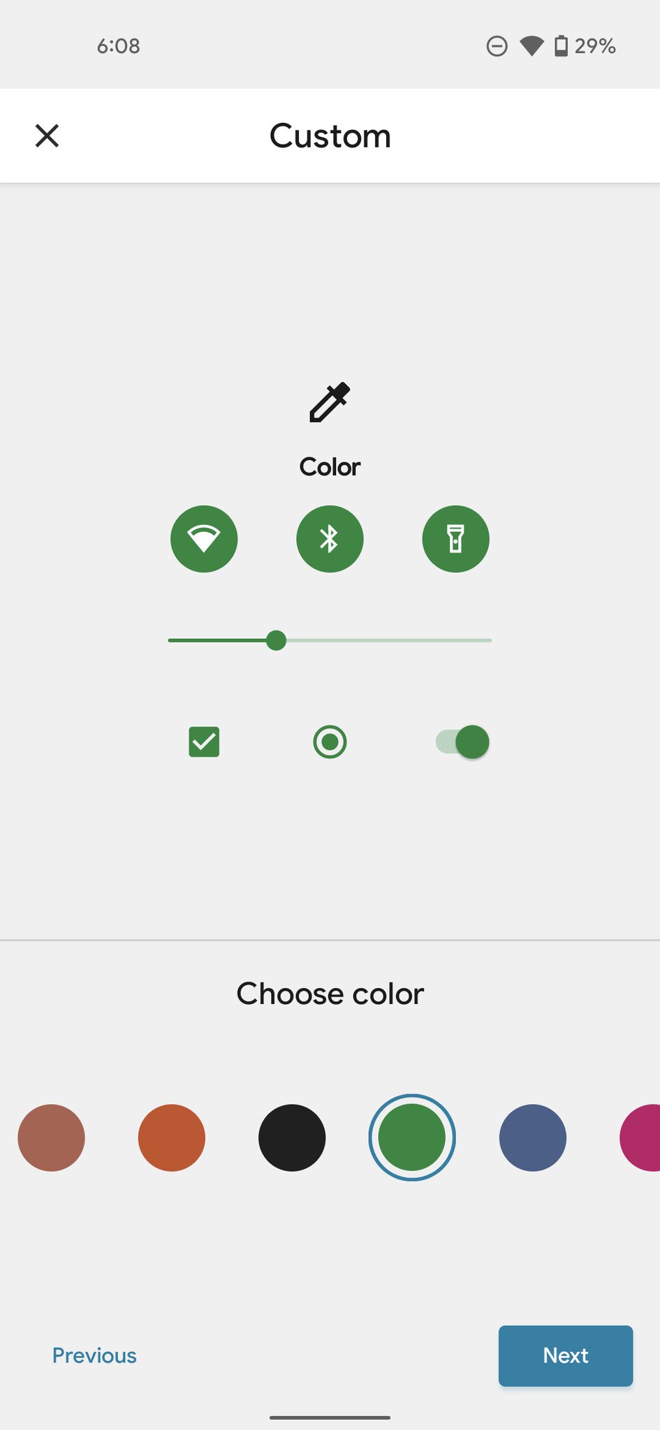
Android 12 features a robust customization engine that lets you alter colors throughout the interface to your liking. Obviously, theming isn't new on Android, with most third-party manufacturers offering extensive themes for nearly a decade now. What's different with Google's implementation is how it's doing it; Android 12 has custom color palettes that change automatically based on your home screen wallpaper. If your wallpaper has blue tones, the system will pick a blue shade and a complimentary color and use those throughout the interface.
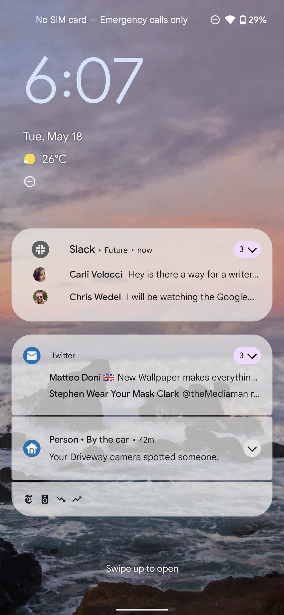
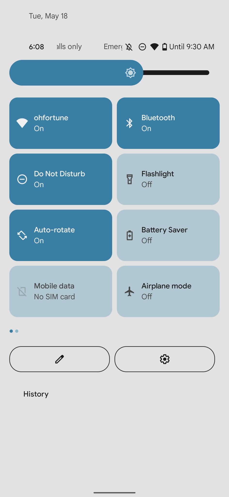
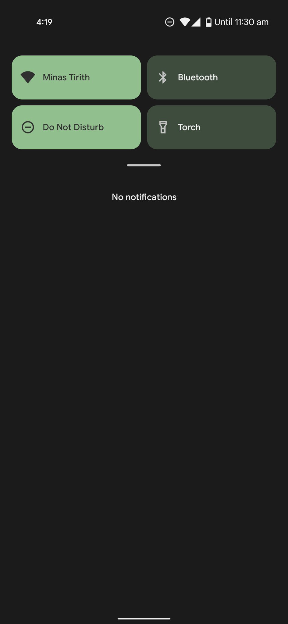
This particular feature isn't live yet in the first Android 12 public beta, but you can manually set colors and see the changes throughout the interface. Google has also redesigned the notification pane with quick toggles that take up much more width; the round tiles have make way for rectangular blocks that are easy to toggle. The blocks fill with color when they're enabled, and it enlivens the notification pane. Sure, there are fewer toggles on the pane because of the increased width, but I don't mind that at all.
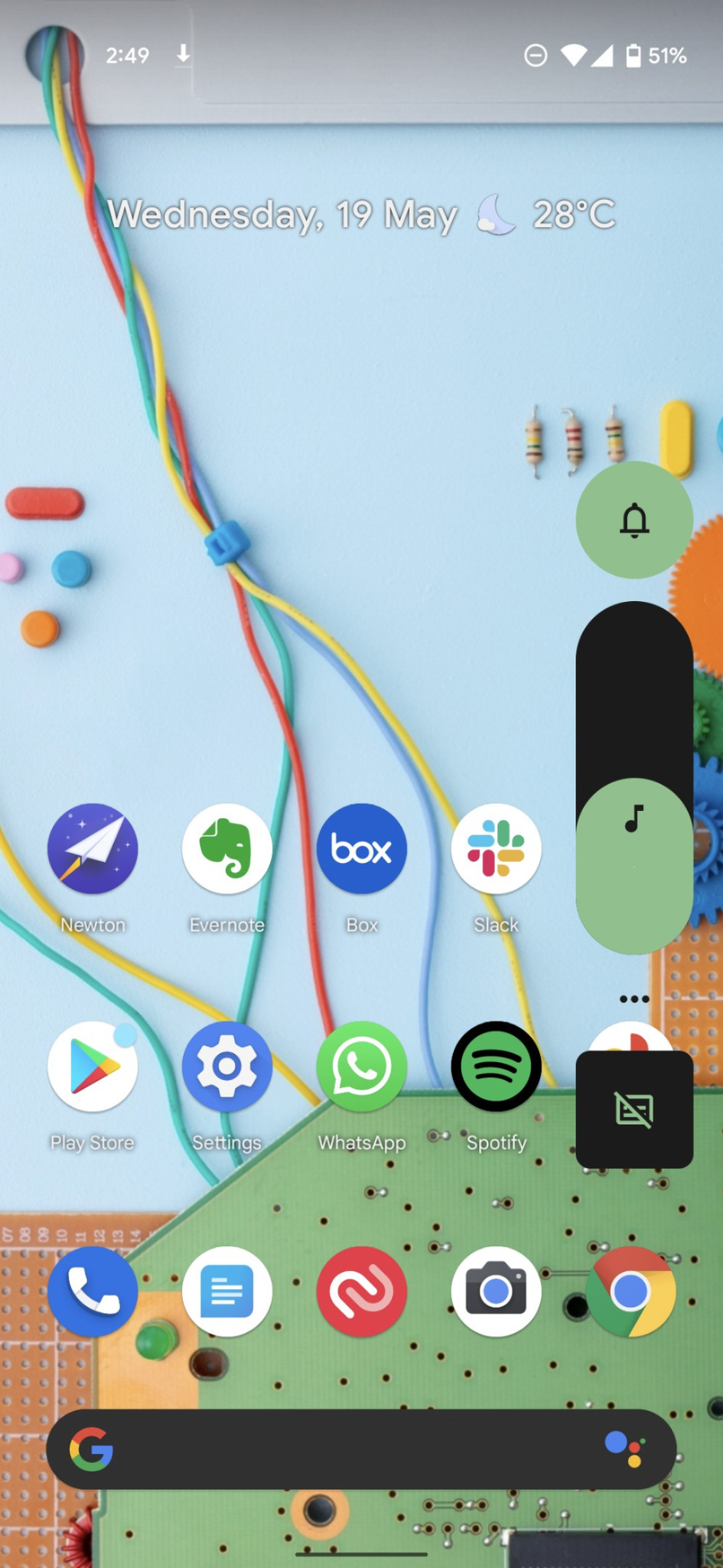
Oh, and as is evident in the screenshots above, the brightness and volume sliders are huge. While I like the changes to the notification pane, the width of the sliders will definitely take some getting used to. Google is also overhauling animations on Android; dismissing a notification has a nice visual flourish, and everything from pulling down the notification shade to just navigating the app drawer feels fun.
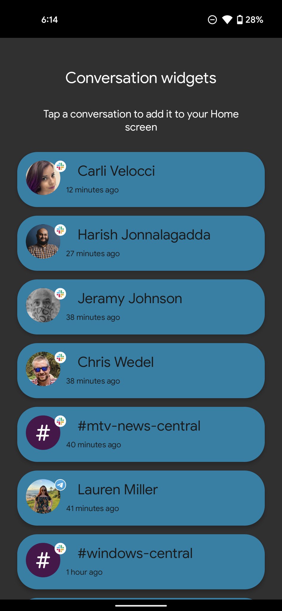
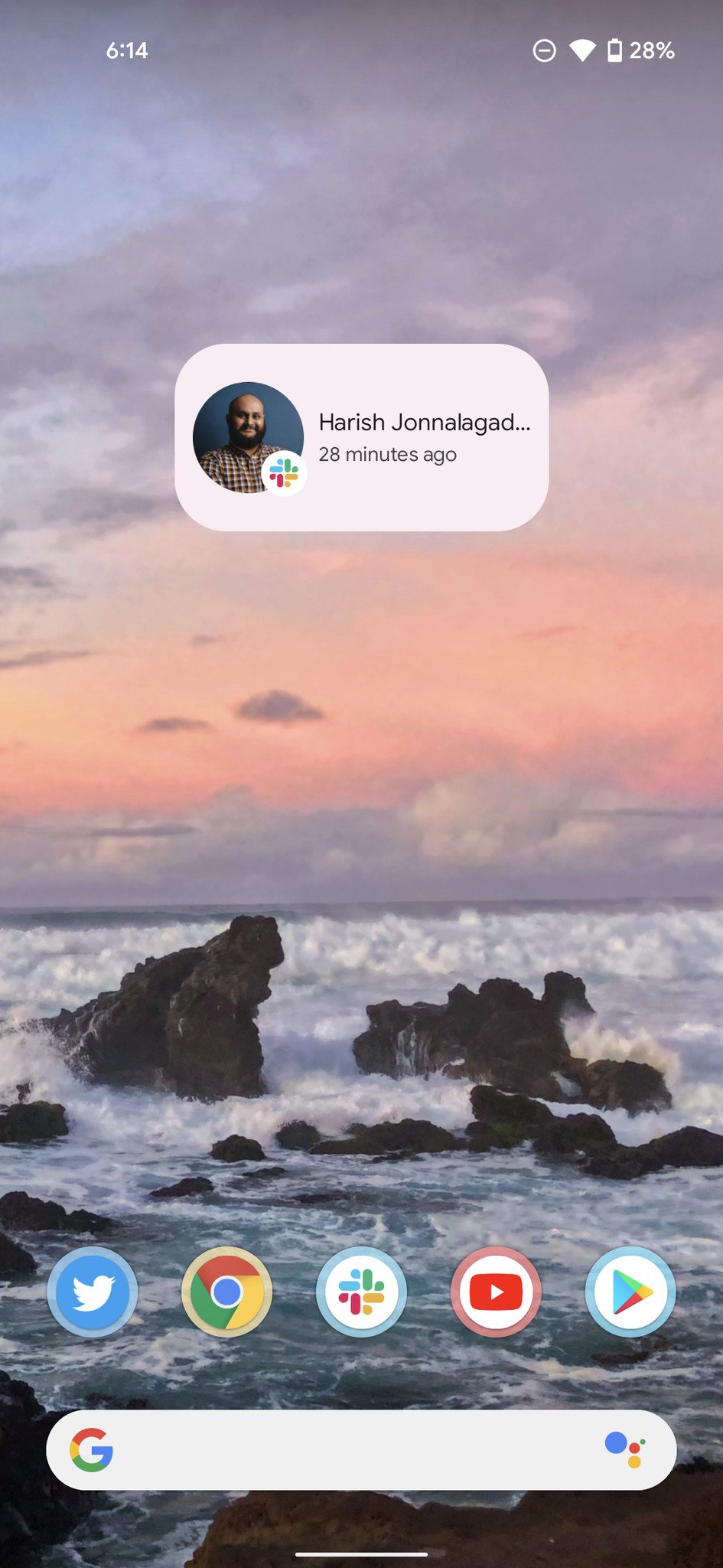
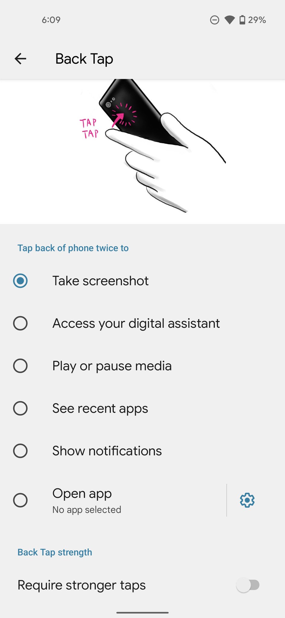
Google says that these "little surprises and playful quirkiness augment basic storytelling—making technology approachable and comfortable." Widgets have also received an overhaul and feel much more cohesive, but then again it remains to be seen just how many devs follow the new guidelines. If you're using a Pixel 5, you can use a back tap gesture for invoking Google Assistant, music playback, taking a screenshot, and more.
Earlier versions of Android ended up being too austere on the design front, and while I personally liked the minimal aesthetic, it's clear that most users want an interface that's highly customizable and personable. The changes to Android 12 make the interface feel much more inviting, and while not everyone will like the design, it is a refreshing change.
Android 12 comes with new privacy and security features
Google is also rolling out a slate of features designed to safeguard your privacy. Android 12 will let you turn off system-wide camera and microphone access via a quick setting tile, so even if you've previously given an app access to your camera, that setting will be overridden if you turn off camera access via the toggle.
Android 12 will prominently highlight whenever a service is accessing your camera or microphone via an indicator that's located near the status bar. Google will also mandate apps to use the new location API that lets you choose between providing your precise location or an approximation.

Finally, Google is introducing a privacy dashboard that shows just how many times an app has accessed the location, camera or microphone details. This is a big deal for privacy on Android, and while these features aren't live in this beta, they should be available in forthcoming builds.
Should you install Android 12 on your phone?
The Android 12 public beta is coming two months after the first dev preview rolled out, but it is still an early release. Google has ironed out a lot of issues from the first two dev previews, and in the little while I've used the Android 12 beta, I didn't face any problems. If you're interested in trying out the build, here's how you can install it on your Pixel.
Like previous years, the Android 12 beta program is available for third-party phones, so if you're interested in trying out the latest Android features but don't have a Pixel, there are plenty of options from the likes of Xiaomi, OPPO, Vivo, and other manufacturers.
from Android Central - Android Forums, News, Reviews, Help and Android Wallpapers https://ift.tt/3fse3eD



Post a Comment