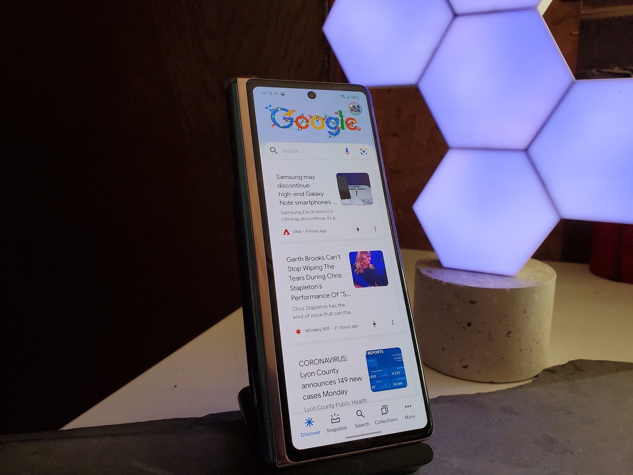
The Google Search app tests a change that we've all been waiting for
But which design or location do you like better?
What you need to know
- Google has been spotted testing new designs and positions for the search bar in the Google app.
- One design puts the user's thumbnail into the search bar at the top of the app.
- Another keeps the current design but with the search bar moved to the bottom of the display.
The Google Search app appears to be testing new looks and locations for its search bar, according to some users in the Google News Telegram (via Mishaal Rahman).
According to the images, the new design could incorporate the user thumbnail into the right-most section of the search bar. This appears to move the search bar further up on the screen, likely to match the current position of the thumbnail in the top right corner of the display. However, it would bring it in-line with other apps like Gmail and the Play Store, which place the thumbnail in their respective search bars.
Another change could be the search bar finally moving to the bottom of the app, although this doesn't appear to feature the user's thumbnail.
Google is testing a few different designs and locations for the search bar in the Google App, according to users of the Google News Telegram group.
— Mishaal Rahman (@MishaalRahman) November 30, 2021
Do you prefer the search bar at the top or at the bottom? pic.twitter.com/AdeHqFXPAa
It's unclear how widely available these new tests are, but there could be benefits and downsides to either. The new design change would consolidate the user settings into the search bar, although at the expense of reachability by moving the bar up further. It would also remove the weather app from the top left corner.
Bringing the search bar to the bottom of the display would be much better for reachability, especially for phones with tall displays like the Galaxy Z Fold 3, but it appears Google would opt to keep the user icon at the top of the display.
Of course, users with the best Android phones could opt to have the search bar on their home screen, but this would still be a welcome change to the actual app.
According to SmartDroid, the bottom bar seems to show up in the Google app beta version 12.47.12, although mileage may vary.
Dynamic and colorful
Google Pixel 6
From $499 at Best Buy $599 at Amazon $599 at Google
It's time to upgrade
The Google Pixel 6 is the latest flagship from Google, featuring a brand new design, great cameras, and intelligent custom-built Tensor processor to enable smart AI capabilities all throughout your phone.
from Android Central - Android Forums, News, Reviews, Help and Android Wallpapers https://ift.tt/3lpLzWx


Post a Comment