One UI vs. OxygenOS: Which is the better Android version?
One UI
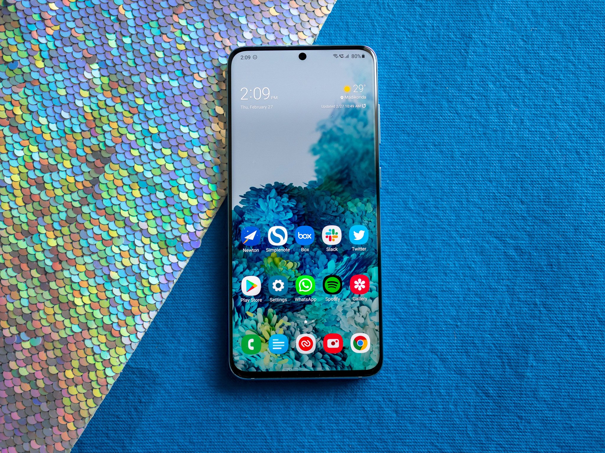
Samsung Galaxy S20
Pros
- Designed around one-handed use
- Ample customization tools
- Kids and Easy Mode
- Blue light filter
- Endless features to play with
Cons
- Can feel a little overwhelming at times
- Design might be too cartoony for some
Samsung's software has changed and evolved a lot over the years, with the most recent iteration taking the shape of One UI. One UI has a distinct appearance, which you may love or hate compared to the stock-like design of OxygenOS. It's also loaded with feature after feature, making it one of the most capable Android experiences on the market. Things can feel a bit overloaded at times, but there's no denying One UI's sheer utility.
OxygenOS
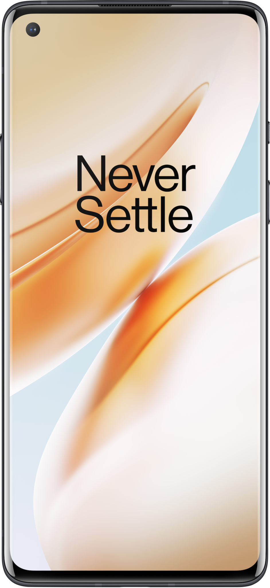
OnePlus 8
Pros
- Clean, simple UI
- Tons of customization options
- Incredibly smooth performance
- Alert slider
- Reading, Zen, and Fnatic Mode
Cons
- Hasn't received a significant UI update in a while
- OnePlus is slow to release new features
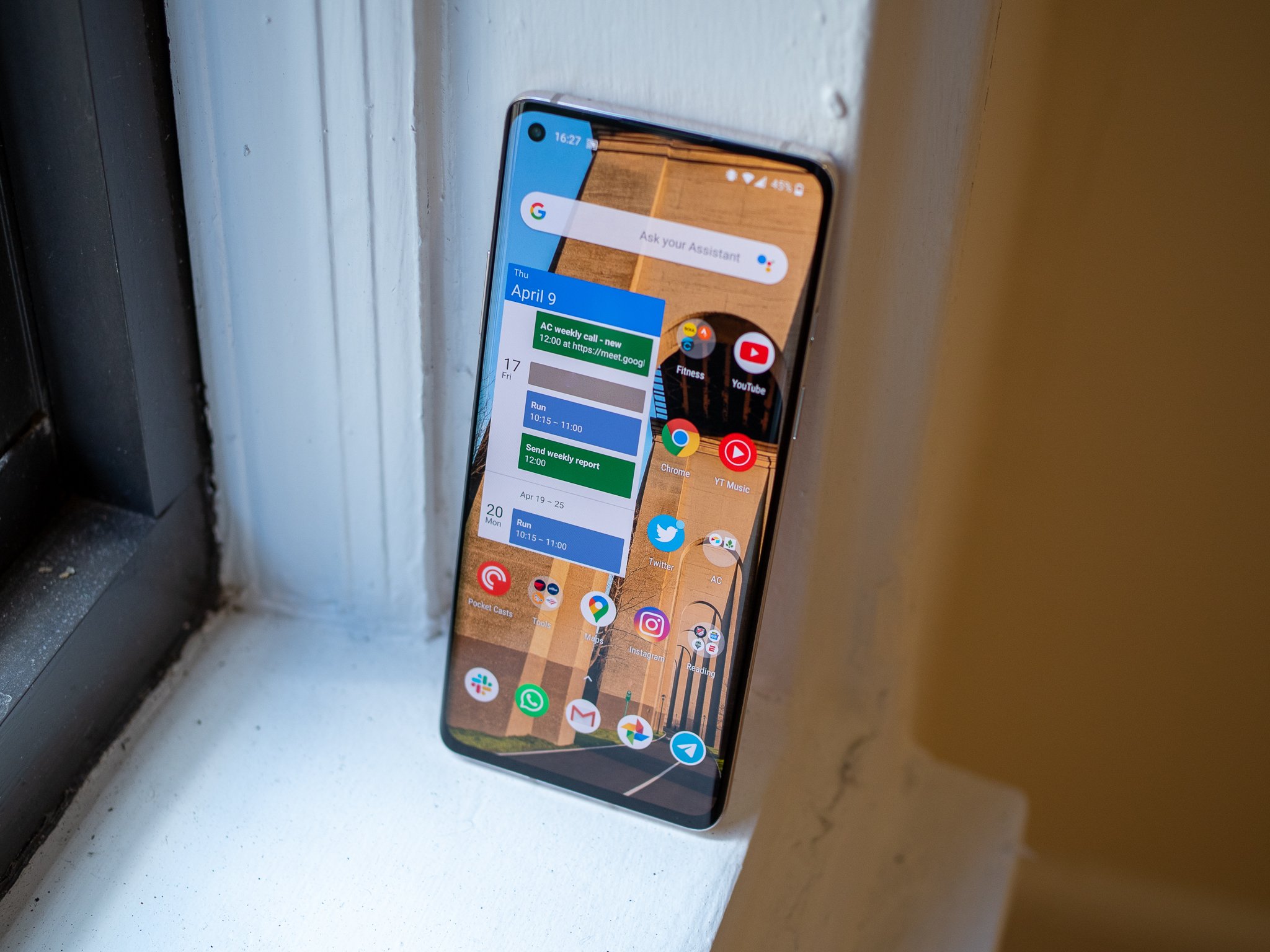
Some people might see OxygenOS as boring compared to One UI, but if you want a more methodical approach to your software, OnePlus's formula is darn near perfect. The quantity of features is lacking, but the ones that are offered feel well-thought-out and genuinely useful in just about every way. OxygenOS also favors a design that's reminiscent of stock Android, but it cranks things up a notch thanks to a wide array of customization options.
One UI and OxygenOS are two very different approaches to Android software, and as such, each comes with its own list of pros/cons. Samsung's One UI has a very bold design with more features than you probably need, adding a lot of utility and function to its devices. Some people might see it as overbearing, however, and that's exactly where OxygenOS comes in as a perfect alternative. There aren't quite as many features to play with, but OnePlus's restraint might be a better fit for you.
A battle of distinct and clean design
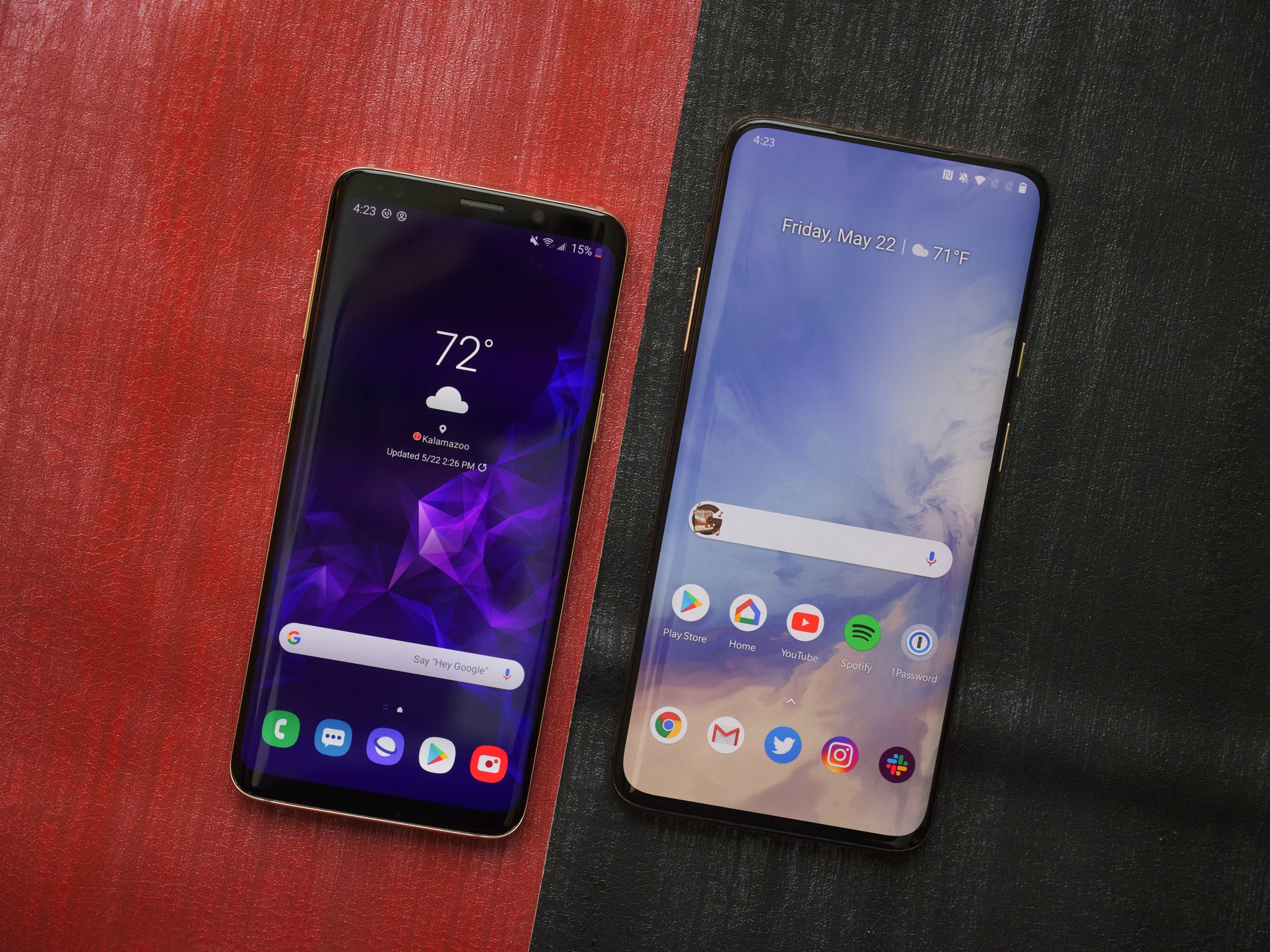
There are a lot of different components that go into creating Android software, but the thing you'll notice the most on a day-to-day basis is how everything looks. In the battle of One UI vs. OxygenOS, the two couldn't be more different.
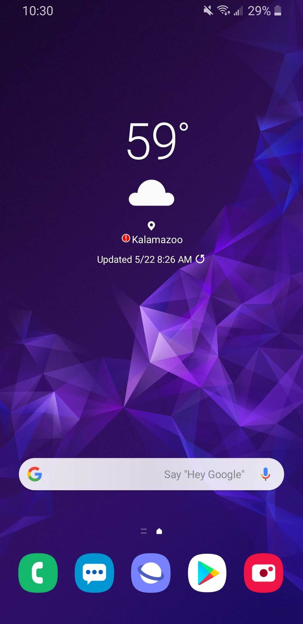
Samsung crafted One UI to have a very bold appearance. It still works like any other Android phone with a home screen and app drawer, but every element has a distinct Samsung flavor to it that's hard to ignore — most notably, the focus on being able to easily reach things with one hand.
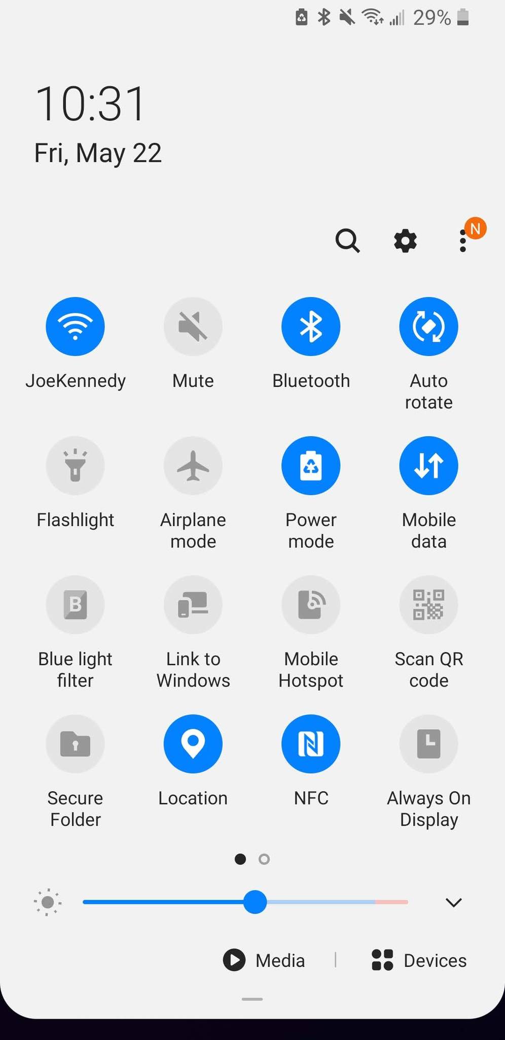
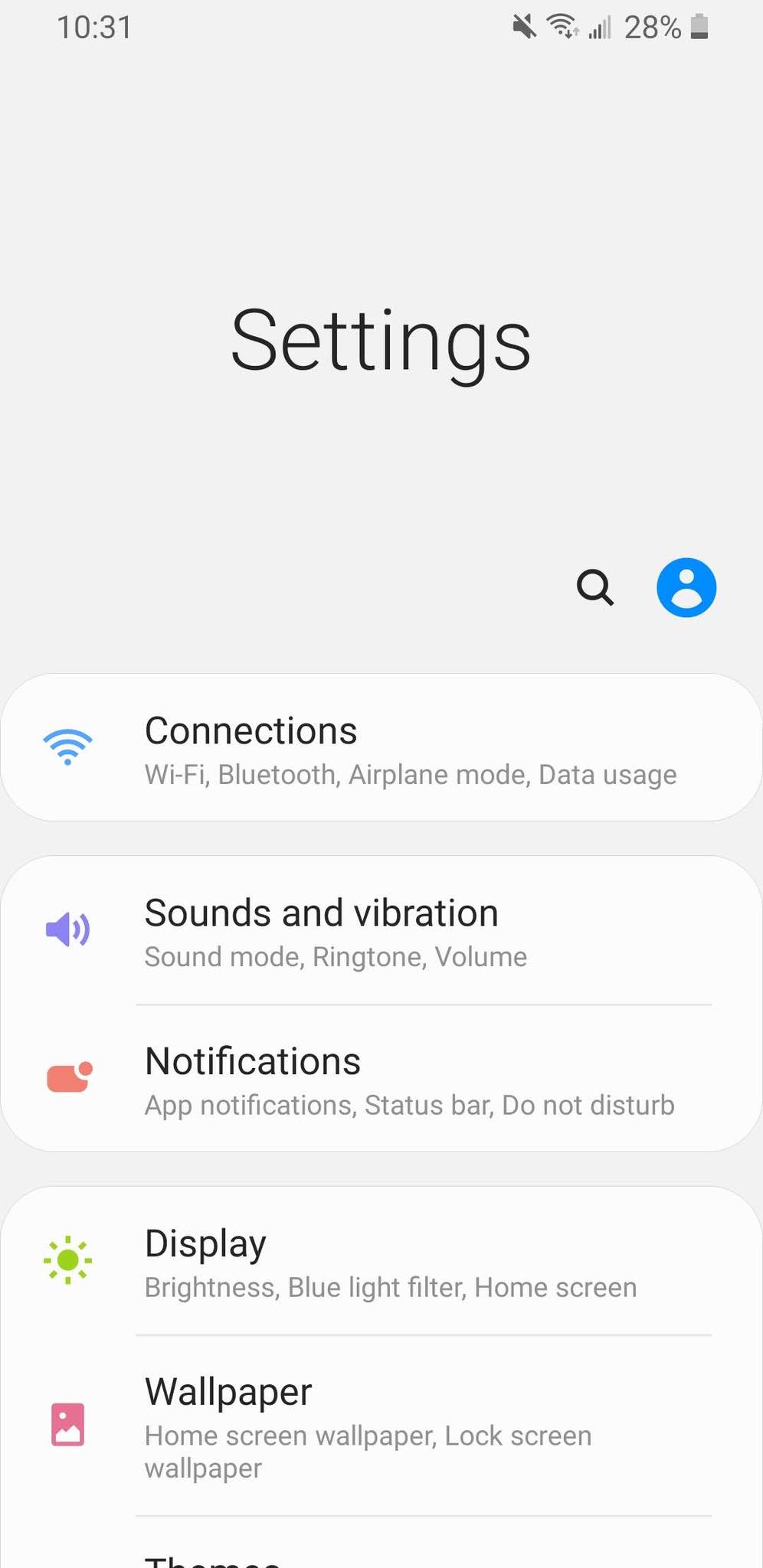
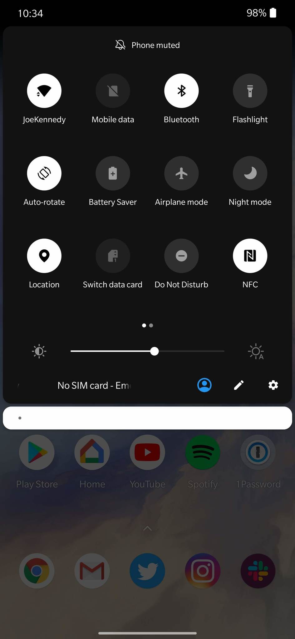
This is the core of what One UI was created on, and all-in-all, it's a great interface. Certain UI elements are brought further down on the screen, making it easier to press buttons and toggles. For example, the settings page pushes a lot of the page links further down than OxygenOS, and the quick settings panel makes the brightness slider easier to reach. These are fairly minor tweaks that not everyone will pick up on, but in daily use, they're greatly appreciated.
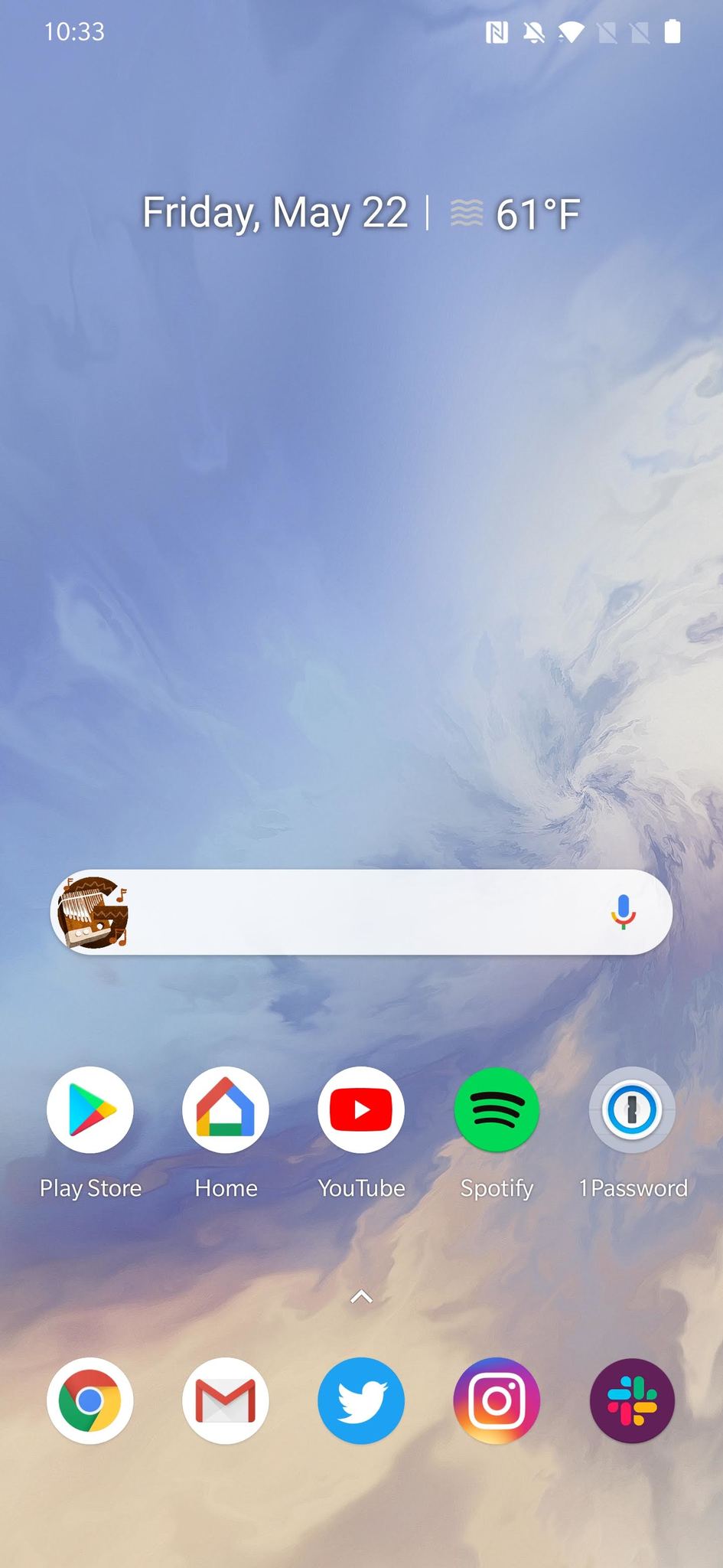
OxygenOS doesn't have anything like this, instead deciding to take the look/feel of stock Android and build upon it. The UI is very reminiscent of what you'd find on a Google Pixel or Android One device, but OnePlus has added features like a custom font and toggles to make it its own.
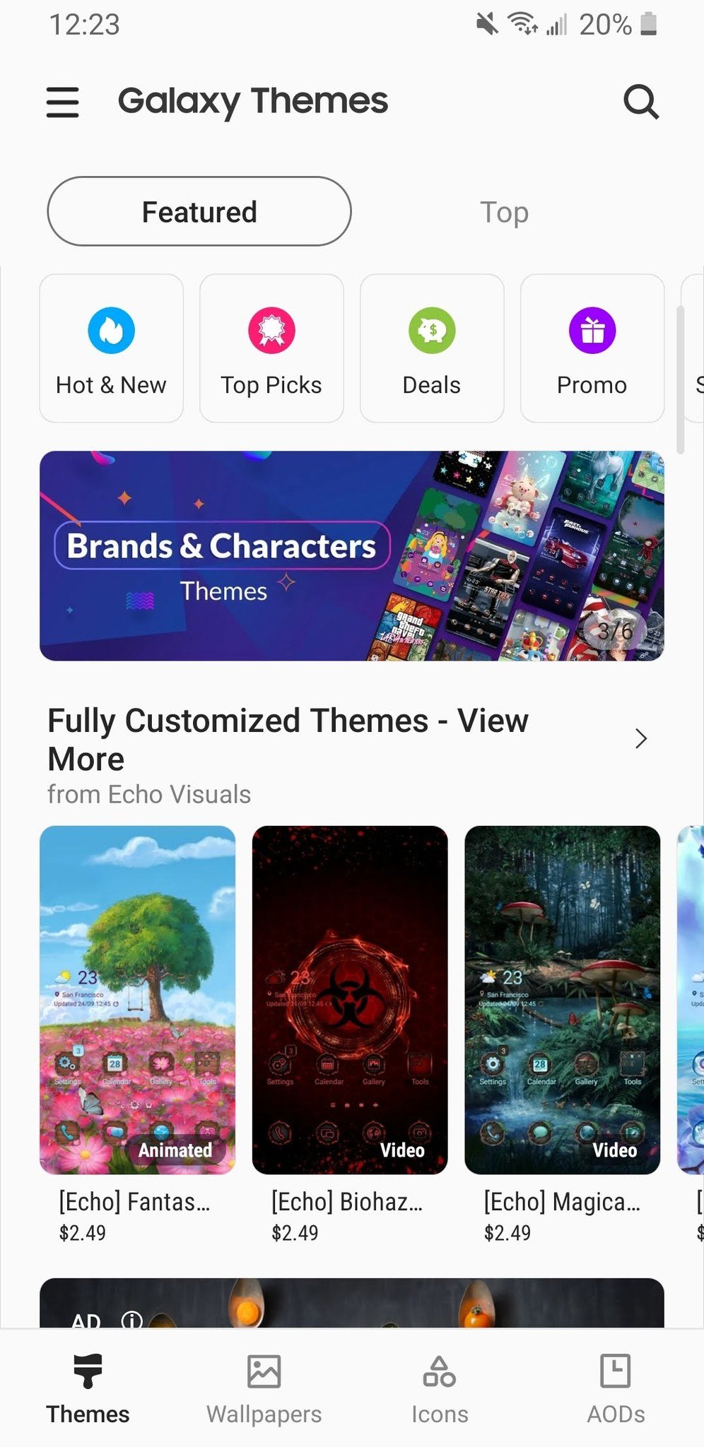
On the design side, both One UI and OxygenOS give you plenty of customization tools to completely change how your phone looks. With One UI, you're treated to Galaxy Themes — a one-stop-shop where you can browse through new wallpapers, app icon packs, and designs for the Always On Display. If you download and apply a new Theme, it'll change virtually every element of your UI all at once.
There's a lot of creativity going on in Galaxy Themes, but the downside is that a lot of them cost money. You can find a few free ones to mess around with, but all of the really good ones require you to hand over some amount of cash.
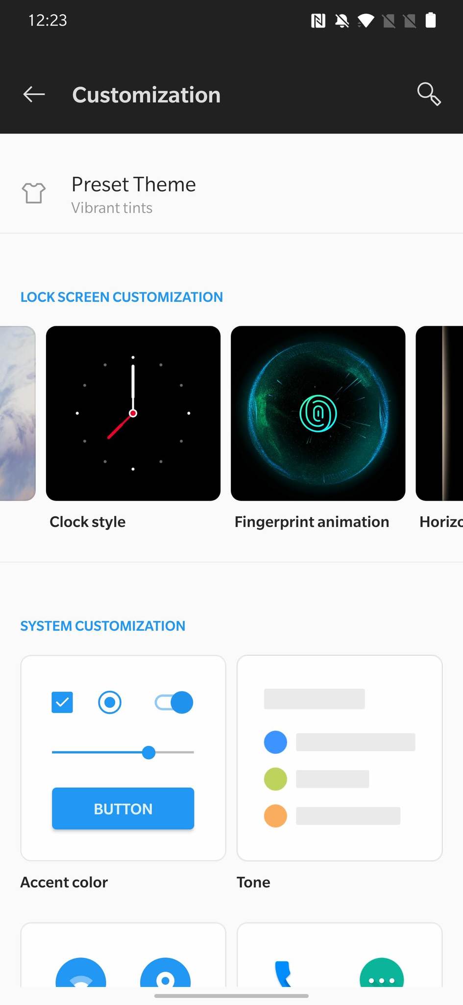
Rather than a dedicated theme store, OxygenOS has a Customization page in its settings. Everything is free to use, and if you ask us, it's the better customization suite. On this page, you can customize:
- Wallpaper
- Clock style
- Fingerprint sensor animation
- Edge light color for notifications
- Accent color
- System icons
- Icon pack
- Font
We'd argue that both of these interfaces are pleasing on the eyes, but there's a simplicity to OxygenOS that you don't get with One UI. Whether it be duplicate apps (Google Photos vs. Samsung Gallery, for example) or cartoony app icons, One UI regularly reminds you that it's a skin built on top of Android rather than an extension of it.
That said, there's no definitive winner in these regards. I prefer the design of OxygenOS, but there are plenty of folks out there that would argue One UI is more visually appealing. This is something that all comes down to personal taste, but as we'll soon talk about, there's a lot more to these software packages than their appearance.
One UI gives you an abundance of features, but OxygenOS finds strength in restraint
Samsung's software has gone through a lot of changes and tweaks. Before we had One UI, we lived through The Samsung Experience and TouchWiz — interfaces that were more cluttered and filled with a lot of bloat. One UI aimed to slim down Samsung's software offering, but it doesn't take much digging through it to realize that there's still a lot on-deck.
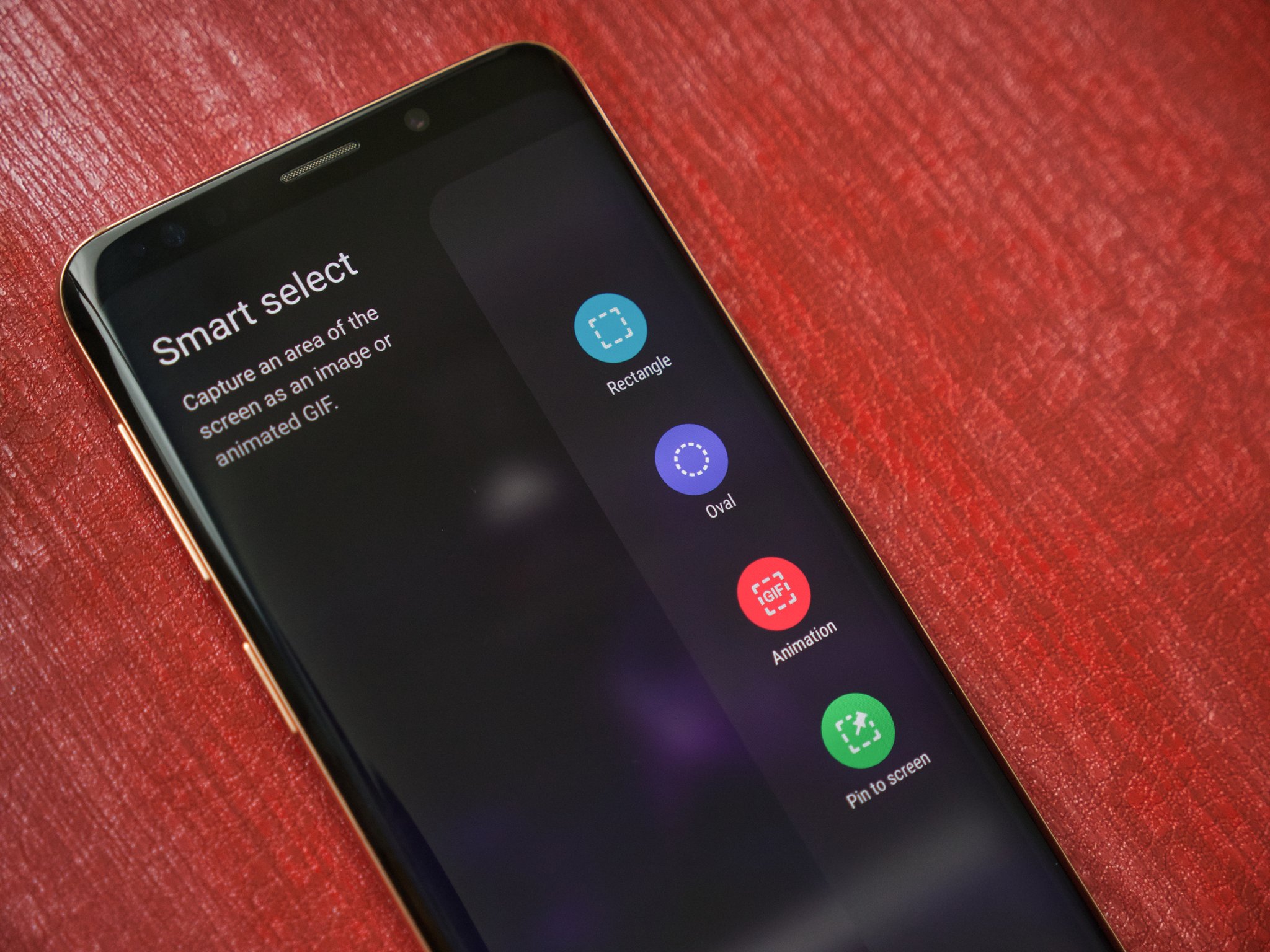
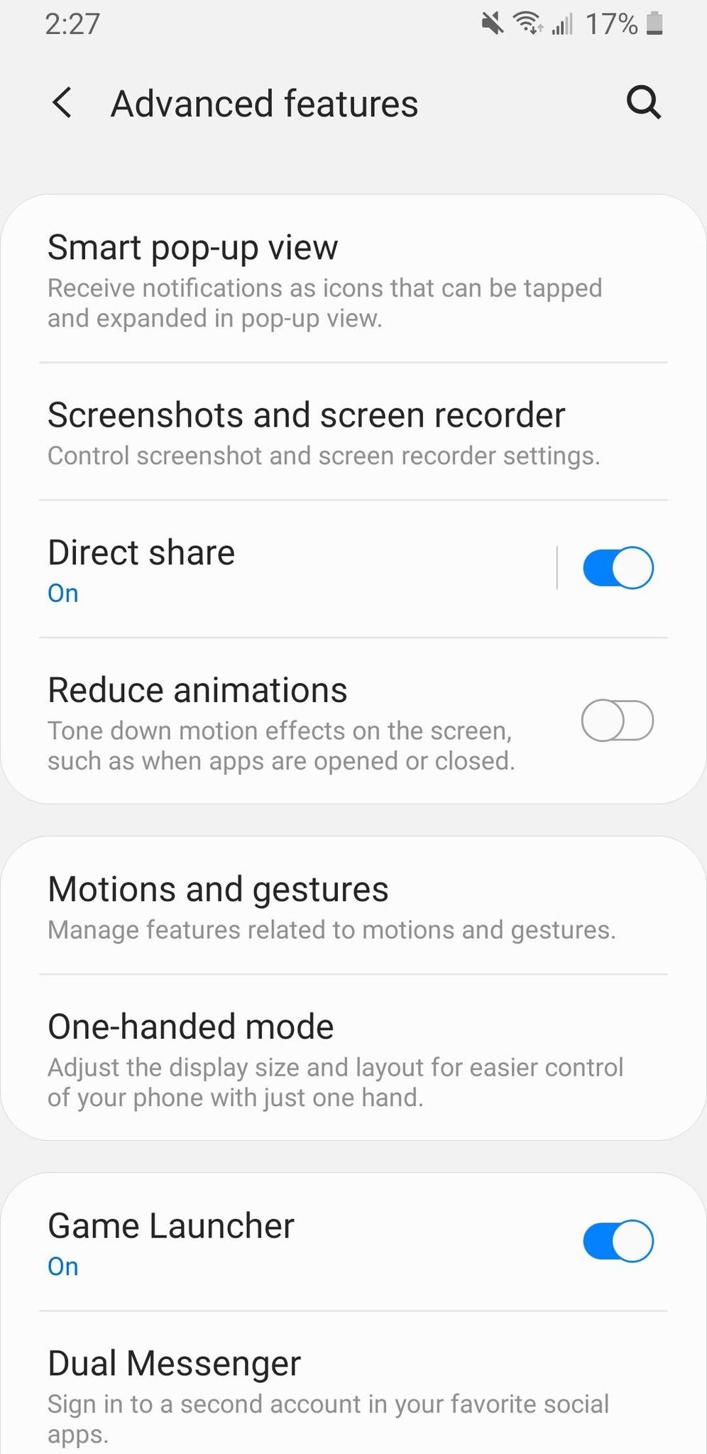
How much? Here's a quick rundown for just some of the extra features Samsung includes:
- Easy mode (makes the home screen easier to use)
- Edge panels (side panel for app shortcuts)
- Edge lighting (custom light effects for notifications)
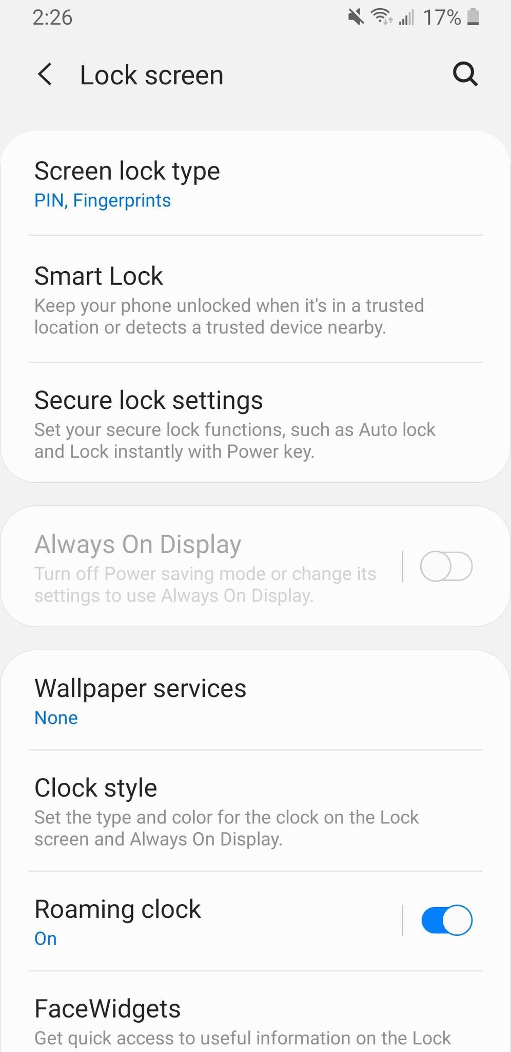
- FaceWidgets (lock screen and Always On Display widgets)
- Lock screen shortcuts (custom app shortcuts on the lock screen)
- Smart pop-up view (custom way to display notifications)
- Smart stay (keeps the screen on while you're looking at it)
- Dual Messenger (be logged into two accounts on one social app)
- Galaxy Store (separate app store from the Google Play Store)
Some of these are more useful than others, and while you do have the option to ignore all of them if you'd like, Samsung's decision to cram so much into One UI means the settings page can feel quite daunting if you're looking for a specific item.
There are a few One UI features that really stand out to me, such as the built-in screen recorder and Always On Display. I think these are genuinely great additions that help Samsung phones stand out, but only using a handful of features in a sea of dozens can feel a bit silly at times. Not to mention, someone that's new to Android would likely find One UI to be a bit daunting given how much there is to sift through.
Just like it does in the design department, OxygenOS shows restraint when it comes to adding extra software features. Unlike Samsung, which likes to throw in the kitchen sink (and then some), OnePlus is very methodical about what it does and doesn't add to its interface. You won't find nearly as many features here, but the ones that do exist are all pretty great.
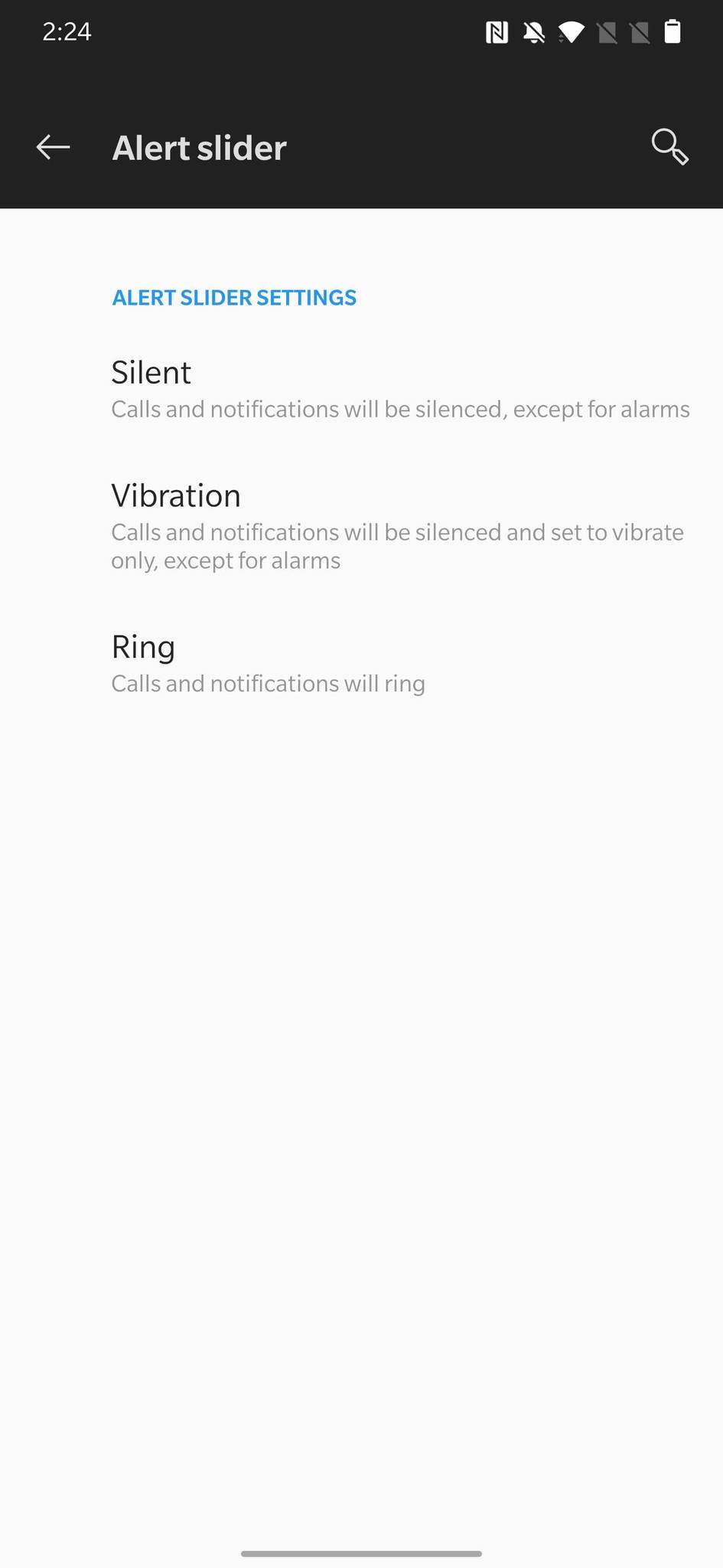
Ever since the OnePlus 2 from 2015, every OnePlus phone has shipped with a physical alert slider that allows you to adjust notification sounds on a whim. It integrates seamlessly with OxygenOS, with OnePlus even giving you settings to control how the slider works (such as whether media volume plays when it's in Silent mode). It's such a small thing, but it's honestly one of my favorite things about OnePlus phones.
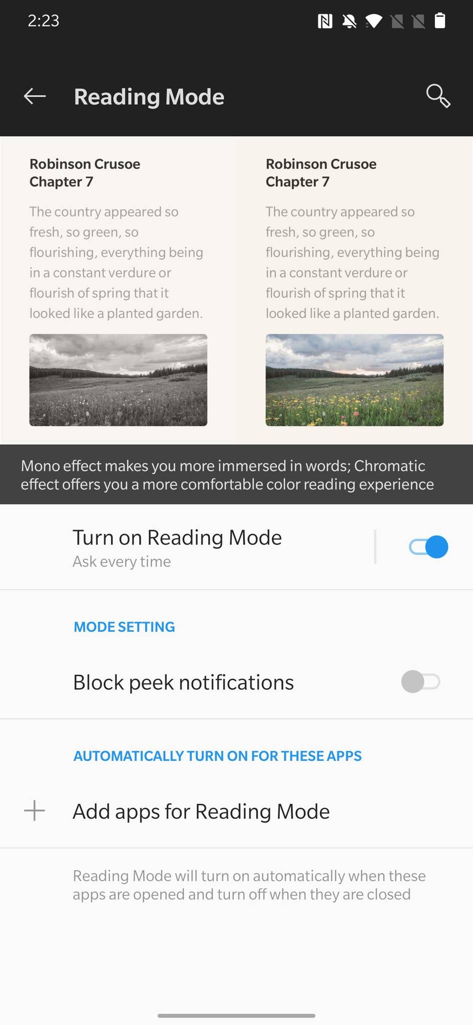
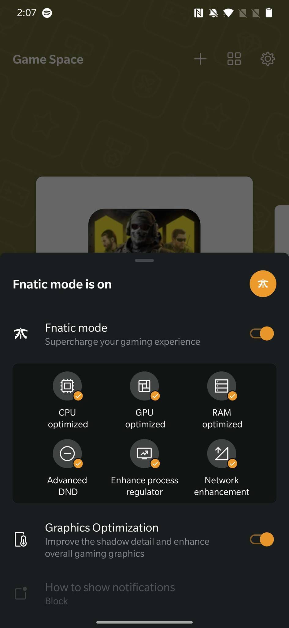
I also really dig Reading Mode, which gives your screen a chromatic or mono effect for more comfortable reading — an essential tool if you like reading a lot of e-books on your phone. If you're more of a gamer than a reader, OnePlus's Fnatic Mode is kind of a dream come true. It optimizes CPU, GPU, and RAM performance while also boosting your network performance and enabling an advanced Do Not Disturb mode.
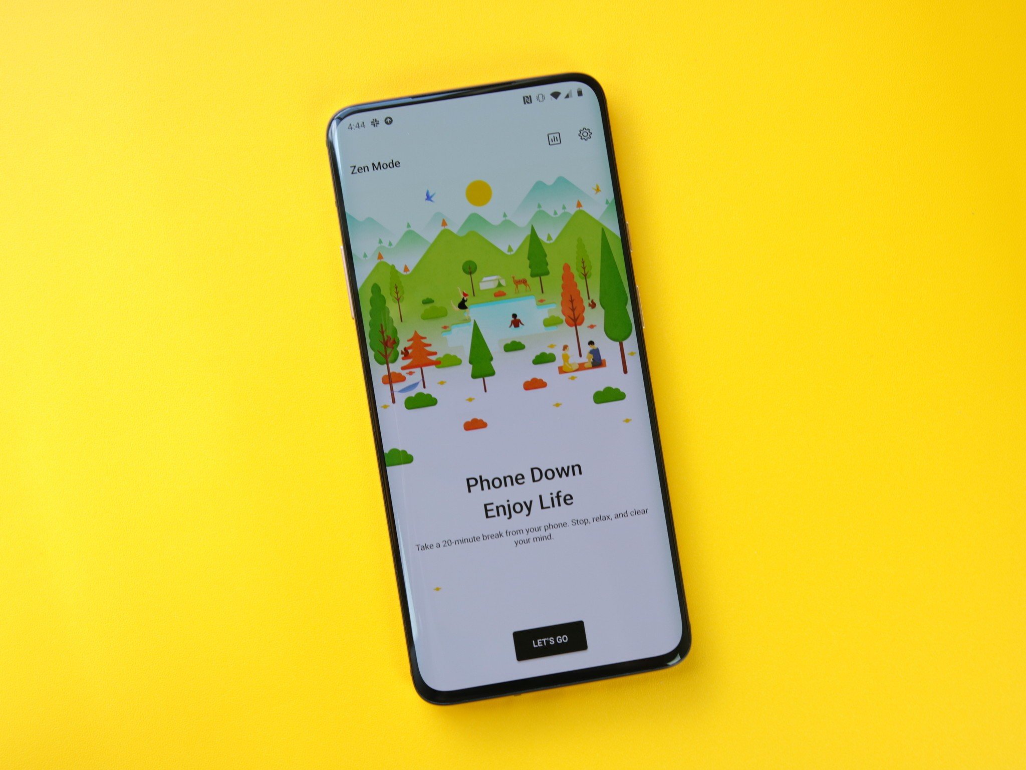
OnePlus even offers something called Zen Mode, which gamifies the idea of using your phone less to promote digital wellbeing. Digital wellbeing tools aren't new for Android, but the way it's implemented in Zen Mode is one of the most unique and effective I've seen to date.
I don't use every single extra feature in OxygenOS, but the ones that I do are hard to live without on other Android phones. I'd also argue that OnePlus does a better job of organizing its settings page in OxygenOS, making it simpler to navigate than the clutter of One UI.
The matter of software updates
Last but not least, good software means nothing if a company isn't going to keep it updated with new features and timely security patches.
Samsung used to be notorious for slow and unreliable software updates, but it's gotten much better in recent years. Most big Samsung phones get two major OS upgrades, in addition to prompt security patches shortly after they're released each month.
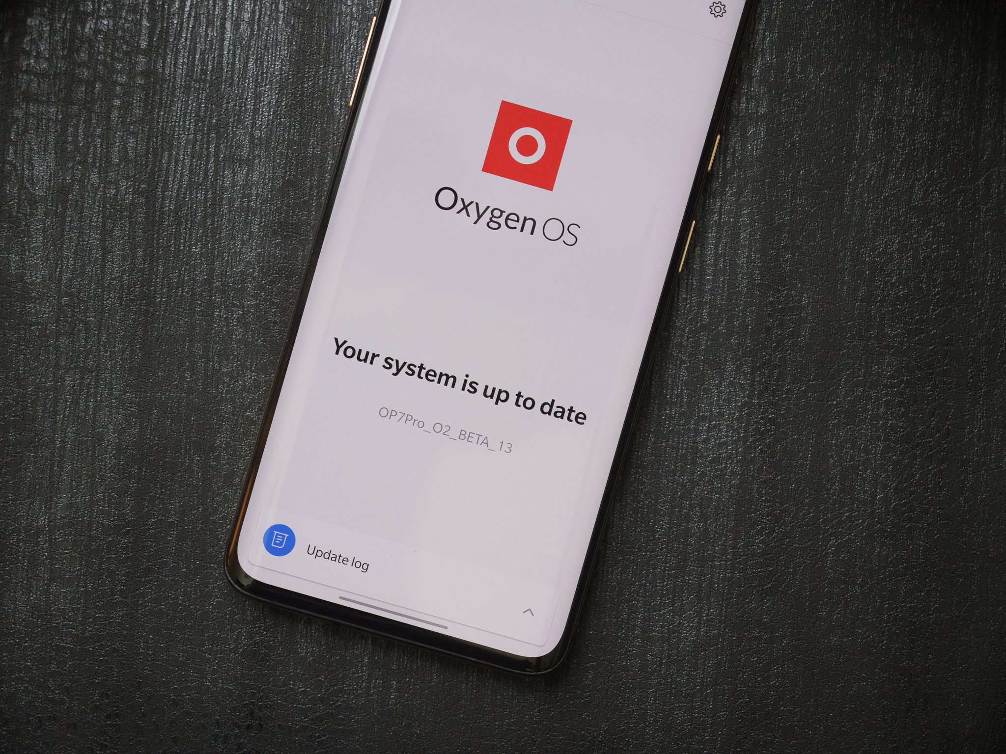
OnePlus also does a good job pushing out big Android updates to its devices — typically offering 2-3 years of support for major updates. For example, the OnePlus 5 from 2017 is set to get Android 10 in the near future.
We'd like to see OnePlus up its game when it comes to security patches, but overall, it remains one of the better companies in this department.
Wrapping things up
While Android serves the same general purpose no matter which phone it's on, there are countless differences as you start to look at custom interfaces each company uses.
Samsung's One UI is leaps and bounds better than its past attempts at software, with it being the most mature-looking and refined one yet. There's still a bit of clutter to deal with, but if you want access to the most features possible, a Samsung phone fits the bill perfectly.
The sheer number of features is less impressive on OxygenOS, but OnePlus has done an outstanding job at creating something that looks fantastic, moves like butter, and comes with thoughtful additions that only elevate the user experience.
There are reasons to love and hate each one, but no matter which one you call home to, you can rest assured both offer two of the better Android interfaces on the market.
One UI
Samsung Galaxy S20
The best way to experience Samsung's software
$800 at Samsung $800 at Best Buy
One UI is available on a multitude of Samsung phones, but one of the best ways to experience it is on the Galaxy S20. On top of all the software goodies mentioned above, the S20 also delivers a gorgeous 120Hz AMOLED display, excellent cameras, long battery life, and a form factor that's actually easy to use with one hand.
OxygenOS
OnePlus 8
Lots of phone, less money to spend
From $699 at OnePlus $800 at Verizon
OnePlus doesn't release as many phones as Samsung does, which means fewer devices out there are running OxygenOS. If you're itching to get your hands on OxygenOS, check out the OnePlus 8. It's one of the most refined OnePlus phones to-date, combining top-notch hardware and nearly perfect software with a seriously competitive price.
from Android Central - Android Forums, News, Reviews, Help and Android Wallpapers https://ift.tt/3gknOeq




Post a Comment